Section 2. Data Visualization#
Data visualization is a term that describes the organization and presentation of data in a graphical representation in order to easily communicate an idea, explore and discover trends, or display a result. More traditional examples include line and scatter plots, tables, box plots, histograms, and heat maps for example. However the rise of big data technologies and tools has also provided inspiration and widespread access for community creations for infographics, geospatial representations, and interactive dashboards and visuals using Tableau, Power BI, D3.js, and R Shiny.
Health Equity and Data Visualization
|
Types of Data Visualization#
The table below contains descriptions and common uses for several data visualization methods. The methods below all share common concerns with data visualization such as clarity/ambiguity, associations, consistency, and aesthetic issues when selecting labels, colors, error bars, and scales, for example. More experienced readers already familiar with basic data visualization methods can continue to the next section on Health Equity Considerations, which details health equity impacts and a more in depth case study.
If you are already familiar with data visualization methods, please continue to the next section. Otherwise click here.
| Method | Description | Common Usage |
|---|---|---|
| Histogram |
|
|
| Line Chart |
|
|
| Box Plot |
|
|
| Map |
|
|
Mitigating Bias in Data Visualization#
While there are many advantages to using data visualization, there are risks also including inaccurate or misleading information and bias. For example, some visual motifs have positive or negative associations and therefore may bias the viewer by carrying these associations into their perception of what is being shown. When making decisions on presentation, clear representation is key and following a set of best practices is recommended, such as those provided by the Urban Institute’s Data Visualization Style Guide. Otherwise, a lack of clarity can inadvertently result in biasing the representation of data.
Data visualization bias often derives from one of the following issues:
Unfair Representation: All groups of persons being displayed should be equally visible and described with equal detail. Showing one group using labels with a much greater font size or brighter color, for example, can result in unfair representation and bias. Descriptions for different groups of people should be clear and consistent.
Associations: Some symbols, colors, text, and tone carry connotations or inherently negative meanings, such as a minus symbol or a frowning face. Colors can also be associated with skin color. Creators should avoid content that carries associations to avoid misunderstanding and bias.
Accessibility: Issues around accessibility generally refer to ensuring that anyone can view and understand the information being presented, including considerations when viewership includes non-technical audiences. For the case where the visual cannot be viewed or accessed, then alternative textual explanations should be included. In addition, some colors are less visible than others, especially to the color blind, and should be chosen with intention.
Ambiguity: Clarity in labeling and description is very important to prevent ambiguity that can result in misunderstanding and bias. For example, the text used to describe results may include wording that is confusing or contradictory to the results being shown. Descriptors may also omit potentially important context for the visual as well, such as count or distribution differences among different groups of people in the underlying data set used.
How Data Visualization is Used#
Some examples of data visualization problems within a public health context are:
Displaying Statistics and Healthcare Trends: Plots are often used to explore and display trends within a data set. Visuals are great mediums for exploring inquiries such as viewing impacts of the flu on a yearly basis in marginalized groups or the prevalence of certain types of injuries or diseases over longer time periods.
Supporting Model Training: Data visualization is used throughout during model training. For example, a deep learning classifier for predicting cancer diagnosis from medical images will be optimized by computing and plotting performance improvement in order to influence hyper parameter tuning to improve Type II errors (false negatives).
Supporting Model Development: Data visualization can be used during the model selection and development phase. For example, residuals are plotted against fitted values to determine how well a regression model fits the data. Homoscedasticity, or homogeneity, of variances in a data set can be visualized to ensure that statistical tests like t-tests and ANOVAs can be applied correctly. Data visualization is also used to display and better understand model architectures for deep learning models and statistical dependence in Markov models and Bayesian networks.
Dissemination of Results: Data visualization is a great way to communicate findings from analyses. For example, statistical significance can be visualized by plotting coefficients and associated confidence intervals from a regression analysis modeling opioid use relative to socioeconomic characteristics.
Communication: Visualizations are often used as a clear and quick way to express information to the general public, such as mapping the community spread of infectious diseases.
Health Equity Considerations#
All design choices for visualizations including the labels, descriptive text, color choices, and scales, as well as the type of plot itself, should be clear, consistent, and appropriate in order to further contextualize the information that is being communicated. For example, when displaying a histogram that compares disease rates in groups of people the calculation for error bars and the scale should be consistent. In addition, the color contrast should be consistent and the chosen colors should not be associated with ethnicity or sex.
The table below includes common sources of bias in data visualization and descriptions of how to mitigate these biases in the context of public health.
Challenge |
Challenge Description |
Health Equity Example |
Recommended Best Practice |
|---|---|---|---|
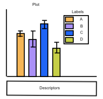
Labels |
|
A peer review is being conducted to evaluate a paper detailing results from a study comparing health outcomes for different ethnicities. One reviewer notices that for all the tables and plots some ethnicity categories are omitted and that “Whites” is often the first category listed despite not having as many data points or meaningful results. |
Every group of persons included should be given clear labels. People-first language is suggested. For instance, the label “Black Persons” or “Black People” is better than “Blacks,” or “Whites,” or “Disabled” because it is more humanizing. Further, consider ordering labels to support the data story rather than default organization and alert the reader to groups that may be missing from the data instead of ignoring or omitting their absence. |
Color Choice |
|
A study was conducted comparing disease rates in people of different ethnicities and results are displayed in a plot with the following legend: |
Colors should be equally visible for each group of people in the legend and the plot and should not be associated with race or gender. Brighter colors that are easy to distinguish for all groups would prevent bias. |
Scale |
|
A study was conducted comparing the effects of exercise on longevity after stroke in men and women. Results are displayed in the following two plots: |
It is best practice for the scales for each graph, especially in a side-by-side composite for direct comparison, to be equal to ease interpretation and mitigate confusion. |
Error Bars |
|
A study was conducted comparing disease rates in people of different ethnicities and results are displayed in the following plot with error bars: |
The calculation method and display of error bars should be the same for each group of people. If possible, a similar number of subjects should be included in each group. Regardless, a caption that includes the sample size would provide some additional clarity. |
Data Encoding |
|
A researcher is analyzing the prevalence of dementia for a population of Black and White persons and decides to characterize its distribution by using a box plot. However, a box plot actually can hide the true shape of the data distribution, which may actually be multi-modal vs normal. In this case, the distribution is bimodal indicating two peaks in the data pointing to two different groups, black and white persons. The original box plot assumes a normal distribution and indicates interquartile statistics for white and black persons as a single group when in reality there exists a disparity in the prevalence of dementia. The following figure shows how combining a box plot with a violin plot, for example, can reveal the true shape of the distribution: |
Descriptive statistics and plotting the raw data using a scatter plot or line chart for example are recommended as initial exploratory steps and thus can help aid in plot type selection. |
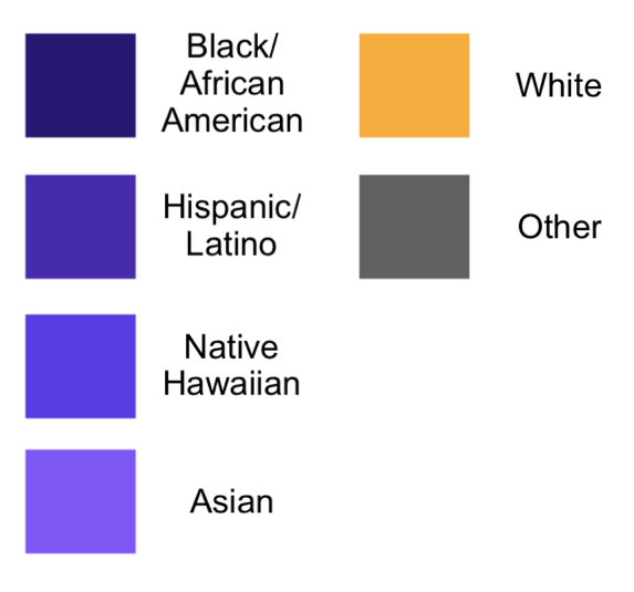 The color choices create a gradient of violet for all people, except for white people and the category other. The color choice for white people stands out compared to all other persons. Further, the gradient could imply skin color is hard to distinguish.
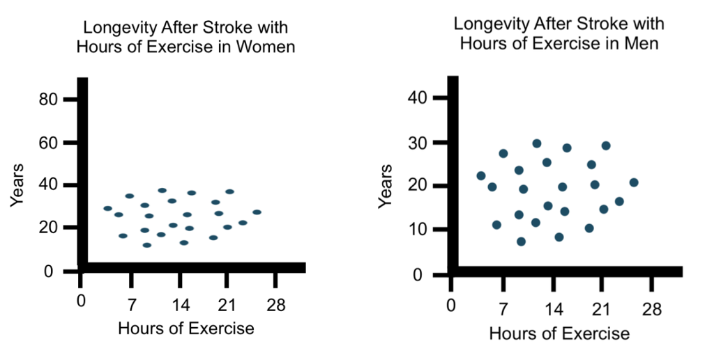 Since the scales in these scatter plots are not the same, at first glance one might think that women don’t live nearly as long as men do after having a stroke. Consistency in scale is important to prevent bias and misrepresentation.
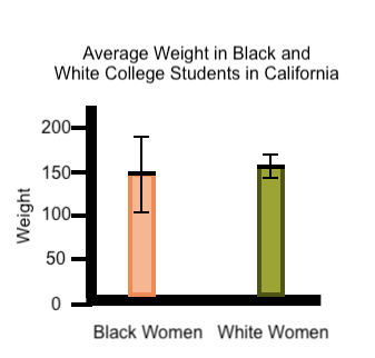 The standard deviation is much larger for black women than for white women. However, the audience does not know that only 3 black women were included in this study. In this case, the greater standard deviation reflects the small sample size.
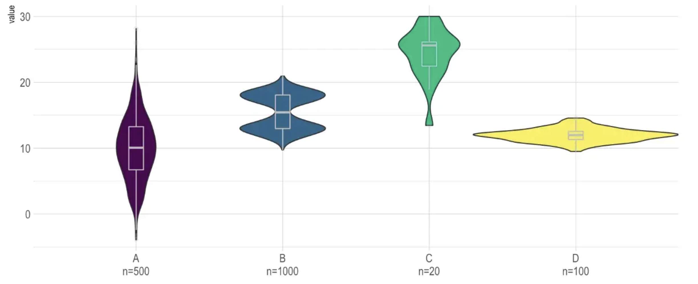
[Bendoly, 2016, Gotz et al., 2016, Mansoor and Harrison, 2018]
Case Study Example 1#
Case study is for illustrative purposes and does not represent a specific study from the literature.
Scenario: A researcher wants to display prevalence of bipolar depression in people ages 20-60 years across the United States.
Specific Model Objective: Build a visualization of bipolar depression cases across the United States. Assess the distribution of bipolar depression cases and compare the characteristics of high versus low density regions. Does the rate of bipolar depression vary with state of residence?
Data Source: Hospital data from each state is obtained for 2,000 total patients with known bipolar depression.
Analytic Method: Patient data is stratified by age, sex, race, and region. Researchers create a visualization displaying the rates of depression across the 50 states. They display rates for people ages 20-60 years and annotate different ethnicities on a map.
Results: Further analysis showed when adjusting for population density and demographics, bipolar depression was found to be highest in Virginia and lowest in Louisiana, Wyoming, and Wisconsin (p<.001).
Health Equity Considerations: The map must display all ethnicities clearly and must be careful not to display anything with negative associations for any ethnicity. When reviewed the following items were noted:
One ethnicity was much more visible than another resulting in unfair representation and perhaps affecting interpretation of the data.
Researchers must take caution to ensure that each ethnicity is represented with equal visibility.
Ethnicities were marked by distinct shapes or colors. One of the shapes carries negative associations or associations with that race. For instance, using plus symbols for white people and minus symbols for black people would be a bad idea. Using any symbol that carries religious meaning would also not be recommended.
Researchers must take caution to ensure that symbols chosen for data visualizations do not carry negative associations for some ethnicities.
In this case, Hispanic people are clearly labeled on the graph with a symbol and a label, but Asian people are only marked with a symbol, resulting in ambiguity in the regions of the map where there is a high Asian population.
Researchers must take caution to ensure that display and labeling are thorough for each ethnicity. Ambiguity may result in misunderstanding and bias.
In addition, the map was created displaying raw counts of bipolar depression cases in each state while the analysis adjusted for the population density. This might conflict with the statistical conclusion that Virginia had the highest rates for example and create an incoherent data story and misrepresentation.
In this example it is important to compare the display of each ethnicity to other ethnicities. Does one of the representations differ drastically from the others? Do any of the representations carry any type of meaning? Clarity of labeling and consistency of display across different ethnicities is important to prevent ambiguity. In addition, does the visual clearly communicate results of the final analysis?
Case Study Example 2#
Case study is for illustrative purposes and does not represent a specific study from the literature.
Scenario: A researcher wants to organize the results of their statistical analysis evaluating the impact of exercise on health in people of different ethnicities across the United States in a high-impact journal.
Specific Model Objective: The researcher believes that exercise preserves well-being and wants to understand if the impact of exercise on health depends on ethnicity. The group conducts a survey about current health and a history of exercise over their life.
Data Source: Survey data is obtained through participation in the study.
Analytic Method: Patient data is stratified by age, sex, race, and region. Researchers tabulate their results in two tables. In one table they show raw data for each ethnicity, listing the occurrence of the most common health concerns for people categorized into low, medium, and high exercise categories. In the second table, they highlight the health concerns that are mediated by exercise for people of different ethnicities.
Results: Exercise was found to preserve well-being in all ethnicities. Exercise was particularly protective against heart-related diseases and showed the greatest effect in the African American population and people of Jewish heritage.
Health Equity Considerations: Researchers must be careful to use consistent detail in denoting each ethnicity. The number of descriptors and appearance of each ethnicity description must be comparable and all descriptions must be clear. The text that refers to the tables must contain clear descriptions for each ethnicity. Some considerations:
One ethnicity is labeled more clearly or is described more clearly than another resulting in unfair representation
Researchers must take caution to ensure that each ethnicity is described and labeled with equal visibility
Ethnicities are described with words that carry associations. One of the words used has a known association with that race. For instance, using any racial terminology or, really any descriptors that are not directly related to the study is discouraged.
Researchers must take caution to ensure that wording chosen for the description of data and results does not carry negative associations for some ethnicities.
The text that refers to the tables describes limited results for Hispanic people compared to Black, White, and Asian people, leaving the effect of exercise on health for Hispanic people ambiguous.
Researchers must take caution to ensure that the description is thorough for each ethnicity. Ambiguity may result in misunderstanding and bias.
In this example it is important to compare the description and labeling of each ethnicity to each other ethnicity. Are all of the descriptions equally thorough? Do any of the descriptions you are using carry any type of meaning that is not intended? Clarity of labeling and consistency of terminology across different ethnicities is important to prevent ambiguity.
Considerations for Project Planning
|